Color psychology in web design is more than just picking pretty hues, it’s about using colors intentionally to evoke the right feelings, build trust, and guide user actions. From the very first moment someone lands on your site, the colors you use are already speaking to them.
Whether you’re designing a personal blog, an eCommerce store, or a SaaS platform, understanding color psychology in web design can dramatically improve user experience and conversions.
If you’re also working on making your site more responsive and user-friendly, check out our detailed guide on smart web application design UX tips.
What Is Color Psychology in Web Design?
Color psychology in web design refers to using color theory and psychological principles to influence how users interact with your site. It plays a crucial role in creating emotional responses, guiding actions, and building brand identity.
Colors can highlight actions, guide navigation, and impact decision-making. A red button might prompt urgency, while a blue background builds trust.
This approach helps designers build stronger emotional bonds between the user and the interface. Rather than seeing the website as a digital tool, visitors connect with it on a personal level. That emotional connection enhances engagement, increases brand recall, and leads to better conversions.
Why Color Psychology in Web Design Matters for User Experience
Strategic use of color can:
- Improve usability
- Boost engagement
- Build brand loyalty
According to the Institute for Color Research, users make judgments within 90 seconds and 90% of that is based on color. That’s why color psychology in web design matters as it directly impacts user perception and behavior.
This psychological principle is also essential in competitive industries like eCommerce or SaaS. When multiple websites offer similar functionality, the emotional tone set by your design through color could be the deciding factor for conversions.
Color influences everything from how users perceive a button’s importance to how they feel while reading long-form content. The right tone can make content more digestible, CTAs more compelling, and interfaces more friendly.
1. Reflect Your Brand Personality
Your palette should match your brand:
- Blue: Trust
- Red: Energy
- Green: Growth
Each color tells a story. A playful brand might lean on bright tones; a luxury brand might prefer black or gold. Integrating color psychology in web design helps convey your brand identity visually.
The connection between brand and color consistency also strengthens recognition. When users consistently see the same colors across your site, social media, emails, and ads, it reinforces their understanding of who you are and what you stand for.
2. Use Emotionally Intelligent Colors
Colors create emotional connections:
- Orange: Confidence
- Black: Sophistication
- White: Clarity
Make sure your palette resonates emotionally with your target audience. Using color psychology in web design ensures that those emotions align with your message.
You can even layer emotional intelligence into your UX. For instance, displaying a green progress bar gives users a sense of achievement, while a red error state creates urgency. Color becomes part of the interface logic.
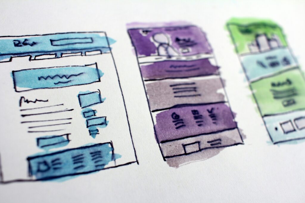
3. Follow the 60-30-10 Rule
A balanced palette keeps things clean:
- 60% background
- 30% UI elements
- 10% accent (CTAs)
This structure helps highlight important areas without overwhelming the user. It’s a simple design tactic powered by an understanding of color psychology in web design.
The 60-30-10 rule not only enhances readability but also ensures visual cohesion. By establishing a visual hierarchy, you help users scan pages more quickly and digest content with ease. It’s especially effective in dashboards, landing pages, and eCommerce product pages.
4. Make CTAs Pop
Use contrasting colors to make buttons stand out. Try red on white, or yellow on black. This increases click-through rates and draws attention.
By applying color psychology in web design, you ensure CTAs are not just seen but they’re clicked.
Beyond contrast, remember placement and surrounding whitespace play a role. A green CTA in the middle of a busy section may underperform compared to a less saturated color with ample negative space. Visual emphasis can be a result of both color and spatial positioning.
5. Respect Cultural Differences
Color meanings vary:
- White: Purity or mourning
- Red: Love or warning
Know your audience to choose appropriately. Tailoring your color choices to user expectations is an essential element of smart color psychology in web design.
For global websites or apps, localization becomes crucial. A color scheme that works well in the United States may not perform the same in Japan or India. Always test your designs across user demographics and geographic segments to get accurate feedback.
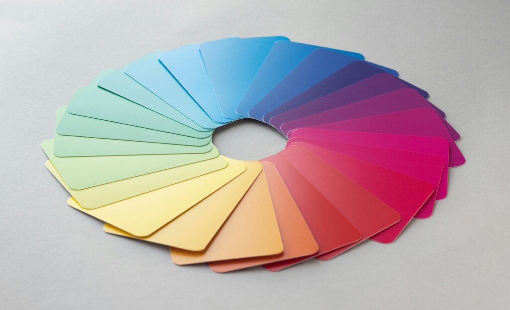
6. Use Smart Tools
Design tools make color planning easier:
Also consult accessibility standards like W3C’s contrast guidelines.
You can also use AI-powered tools to generate palettes based on mood boards, photos, or brand archetypes. These tools can recommend combinations that align with both emotional goals and accessibility standards.
7. Design for Accessibility
Accessible palettes:
- Use high contrast
- Avoid red/green combos
- Include text or icons
Test with tools like WAVE or WebAIM. Designing for everyone is a smart application of color psychology in web design.
Don’t forget to design for low-vision and colorblind users. Approximately 8% of men and 0.5% of women have some form of color vision deficiency. Adding texture, shapes, or labels ensures that users who cannot see color can still interact fully with your website.
Additional Applications: Where Color Strategy Matters Most
Login and Signup Pages
These are critical touchpoints. A friendly blue background with a green login button might build a sense of safety, while a harsh red could create hesitation.
Pricing Tables
Color hierarchy can guide attention to the “most popular” plan. Highlighting this option with a slightly brighter background and an inviting CTA color can drive conversions.
Error Pages and Alerts
Design them with empathy. Use soft red or amber tones for warnings, paired with friendly microcopy.
The Future of Color Psychology in Web Design
As personalization grows, expect more:
- AI-driven palette adaptation (based on time of day or mood)
- Theme customization options for users
- Emotion-responsive UI elements
Voice UI and mixed reality interfaces will also influence how color is used to anchor attention or replace gestures. Even in minimalist designs, subtle shifts in hue will carry meaning.
Additional Insights: Advanced Strategies for Applying Color Psychology in Web Design
To expand your grasp on how color psychology in web design truly influences users, let’s explore advanced implementation strategies that blend color theory, real user behavior, and cognitive psychology.
A/B Testing Color Schemes
Many businesses overlook the importance of testing their color choices. Even when a brand has settled on a particular palette, A/B testing can reveal surprising truths about how different combinations perform. For example, switching a CTA button from orange to green may result in a 25% increase in clicks simply due to higher visibility or emotional resonance.
A/B testing tools like Google Optimize or Optimizely can be used to test:
- Button colors
- Background versus foreground contrast
- Navigation bar highlights
- Notification colors
Tracking conversion metrics before and after a color change offers concrete insight into user preferences. These data-backed decisions ensure your use of color psychology in web design leads to measurable improvements.
Color Mapping the User Journey
Different stages of a user journey require different emotional triggers. For example:
- Landing page: Use calming or trustworthy colors like blue to reduce bounce rate.
- Product pages: Energizing tones like orange can prompt quick decisions.
- Checkout pages: Softer shades of green build comfort and assurance.
Color mapping involves planning out your entire funnel—from homepage to conversion—and selecting colors that psychologically support each phase. This strategy reinforces the goals of each step while reducing drop-offs.
Color and Content Readability
Legibility is one of the most overlooked areas in web design. Using the wrong background-to-text color ratio can cause strain and decrease retention.
Ensure your content areas:
- Use a contrast ratio of at least 4.5:1 for normal text
- Avoid light grey on white or bright yellow on black
- Provide light and dark mode options for personalization
Improved readability supports better SEO, longer time on site, and a more inclusive experience—all of which stem from smart color psychology in web design practices.
Color and Conversion Funnels
Marketing funnels rely on psychology. From awareness to action, colors can help you direct and retain traffic.
Here’s how you can use colors at each funnel stage:
- Awareness: Cool and calming colors for blogs, newsletters
- Interest: Warmer hues like red or orange to catch attention
- Desire: Deep blues or purples to establish sophistication
- Action: Contrasting CTAs like green or orange
Color choice here is critical to crafting emotional momentum. By aligning color psychology with funnel strategy, you drive users forward naturally.
Integrating Seasonal or Event-Based Colors
Brands like Starbucks or Spotify update their UI for seasonal promotions. Think red-and-gold themes during holidays or bright pastels in spring.
Advantages include:
- Keeping the interface feeling fresh
- Creating time-sensitive urgency (great for sales)
- Strengthening emotional connection through relevance
Just make sure changes don’t disrupt usability or clash with your base brand palette. Applying temporary color overlays with careful planning still aligns with effective color psychology in web design.
Color and Brand Archetypes
There’s a direct link between Carl Jung’s psychological archetypes and brand identity. Brands usually fall into 12 categories—like The Creator, The Caregiver, or The Rebel.
Each archetype resonates with specific colors:
- The Hero (Nike): Bold reds, deep blues
- The Sage (Google): Clean whites, balanced blues
- The Lover (Chanel): Black and gold
Aligning your site’s palette with your brand archetype ensures authenticity and emotional clarity.
Using Neutrals to Balance Vivid Colors
Bright colors are great for drawing attention, but too much can feel overwhelming. Neutral colors (grays, beiges, soft whites) offer visual relief.
Use them for:
- Backgrounds
- Spacing
- Typography
By balancing energy and clarity, you allow users to focus. This harmony reflects thoughtful application of color psychology in web design.
Psychology of Warm vs. Cool Colors
Colors are categorized as warm or cool:
- Warm (red, yellow, orange): Stimulating, active, attention-grabbing
- Cool (blue, green, purple): Calming, stabilizing, peaceful
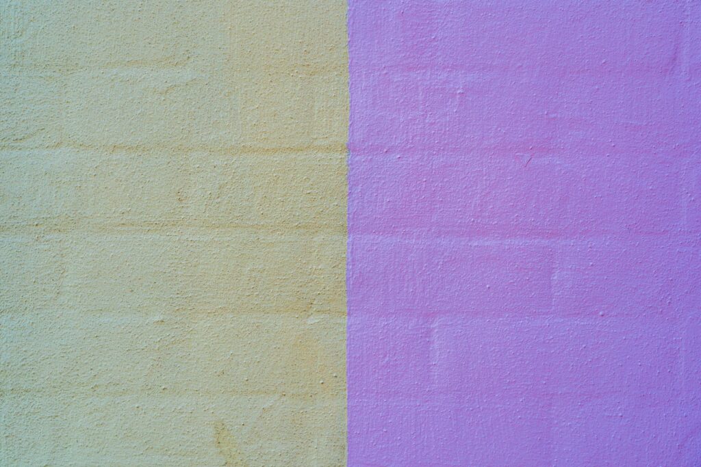
Use warm colors sparingly for urgency (sales banners) and cool colors for trust (contact forms, privacy policies).
Understanding this basic psychological model makes your choices more strategic and emotionally targeted.
Case Studies from Top Brands
Dropbox
Uses calming blue and white to emphasize simplicity and security.
Netflix
Black and red create an immersive, cinematic experience.
Mailchimp
Bright yellows and playful illustrations make the brand feel approachable.
Each of these brands has successfully implemented color psychology in web design to deepen user trust and engagement.
Accessibility Testing and Inclusive Design
Don’t just check contrast ratios. Test your color usage with real users from diverse backgrounds.
Use tools like:
- Color Oracle (simulate color blindness)
- Stark (Figma plugin)
- Accessible Brand Colors (color pairing checker)
Inclusivity should never be an afterthought. Make it part of your initial design phase.
Color as a UX Design Tool
Colors influence:
- Scroll behavior (highlighted sections draw more attention)
- Dwell time (calming colors increase reading time)
- Click prioritization (highlighted cards or menu items)
When used intentionally, color becomes a silent guide, shaping behavior without being intrusive.
Final Thoughts: Color That Works
Color psychology in web design drives emotion and action. By choosing the right palette, you guide users, build trust, and create memorable experiences. It’s not just about beauty, it’s about making your design work smarter.